
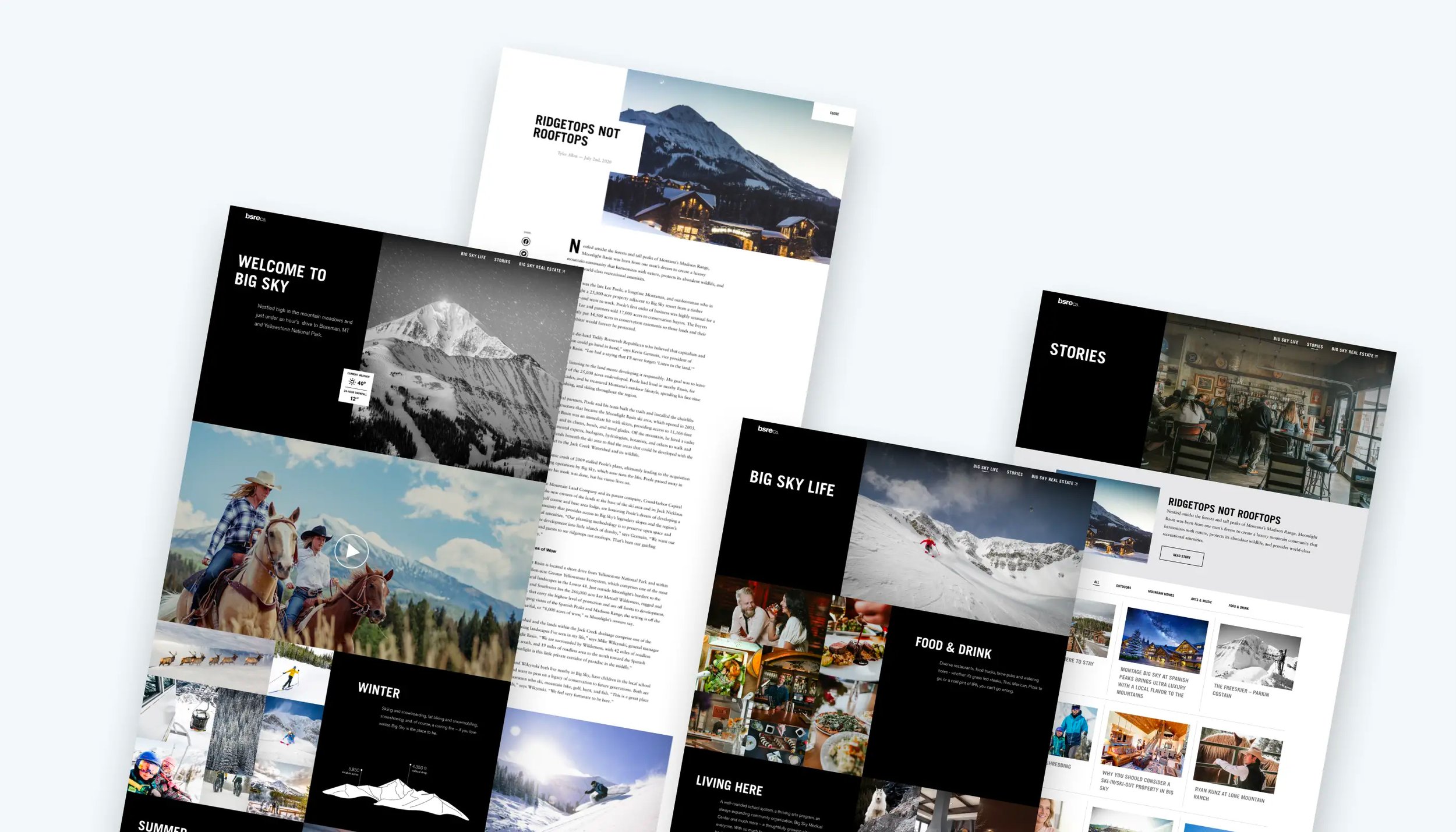
Big Sky Real Estate Website Redesign
BSREC wanted to get people excited about the Big Sky area by converting its website into a lifestyle site designed to provide information about the area. The goal was to decrease the bounce rate for bigsky.com and have the site act as a cultural hub for the region. After showing the user everything Big Sky offers, they could connect the visitors to a separate real estate site, converting them into potential buyers.
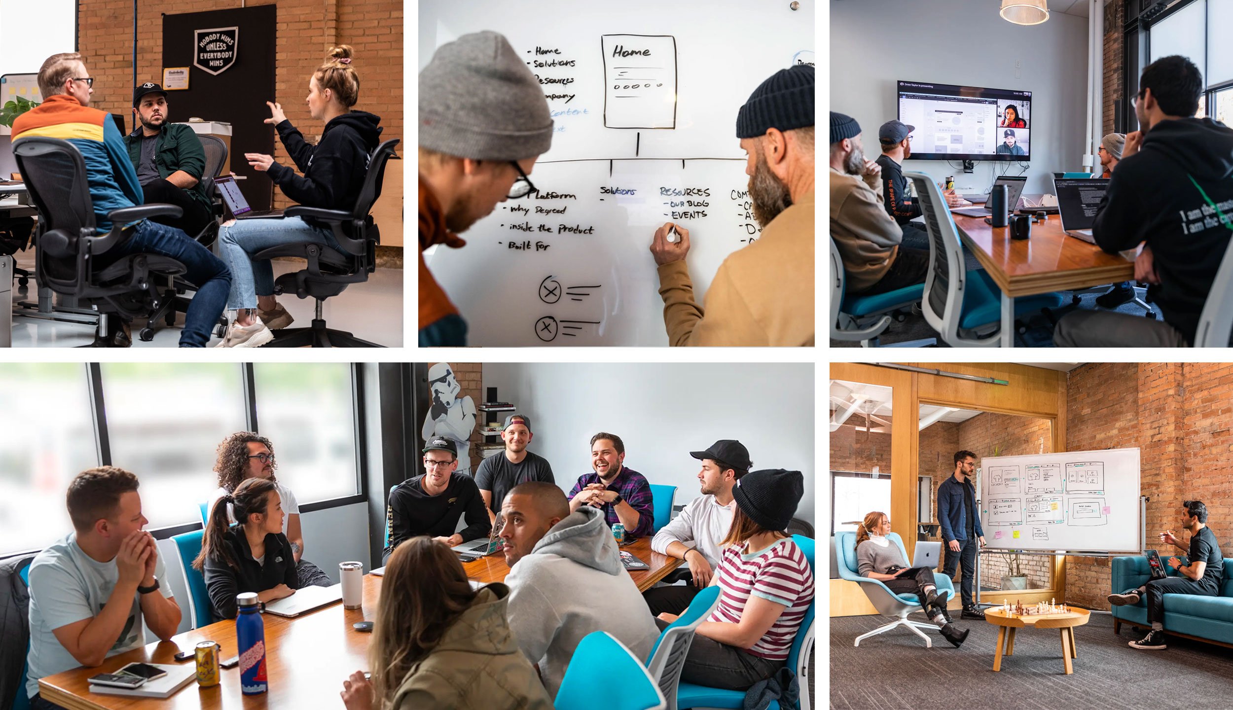
The visual design team started by running a few workshops to kick off the project and better understand the goals and customers. We decided to highlight the Big Sky culture to reduce the bounce rate and capture potential visitor emails. To ensure the site paths work for the target customer, we set up four personas - the second homeowner, the new resident, the winter recreationalist, and the seasonal worker. We used these personas as a baseline throughout the project. Once we produced a site map for better alignment and site structure, we started sketching and prototyping ideas for each page.
Through a series of feedback sessions coordinating with the Big Sky team, we showcased the Big Sky Real Estate Company's high-end, bold, and progressive tone throughout the site. The bold aesthetic helped drive focus to the Big Sky lifestyle and culture. By linking to the real estate site, we helped encourage and empower the user to take action towards a new life in Big Sky.
We delivered a site that aligns with the BSRE Co. brand and visually highlights the culture and area of Big Sky, Montana. By emphasizing the different seasons and activities for the Big Sky area, we could attract interest and transfer visitors to the real estate site.

Reserves Dashboard Design for Square
Reserves help sellers avoid a negative balance from unexpected chargebacks. By keeping a portion of sales safe in a reserves balance, sellers can ensure that they will always have enough money to cover any sudden expenses.
After talking with sellers with a reserve, Square found that the current dashboard is hard to find and doesn't show the data sellers need to stay on top of their expenses. We used this information to inform our design decisions and created a communication-oriented experience that explains all nuances of a seller's reserve.
Tiered Reserves are a series of tiers related to a seller's processing that determines a hold rate. It's a complex process involving many different numbers and time schedules. To ensure that the information is easily understood, we focused on making it glanceable and surfacing the most relevant processing information. Surfacing this information allows business owners to quickly see what would happen to their finances if they were to make a sale at that moment.
Throughout the project, we were able to add clarity for sellers wanting to protect themselves from the risks involved for small businesses. Our design and development teams designed features that increased the number of contracts sent and signed. For reserves, we utilized hierarchy and emphasized making information glanceable to allow sellers to get in and out, finding the data they need quickly. It was important to us to make sure sellers with a reserve understood all aspects of the tool, so we worked with the content team to craft emails and informational cards that the seller could reference at any point.
Working with Square, we were able to help unblock their risk teams while advocating for sellers in a complex problem area.

Journey Mapping Exercise
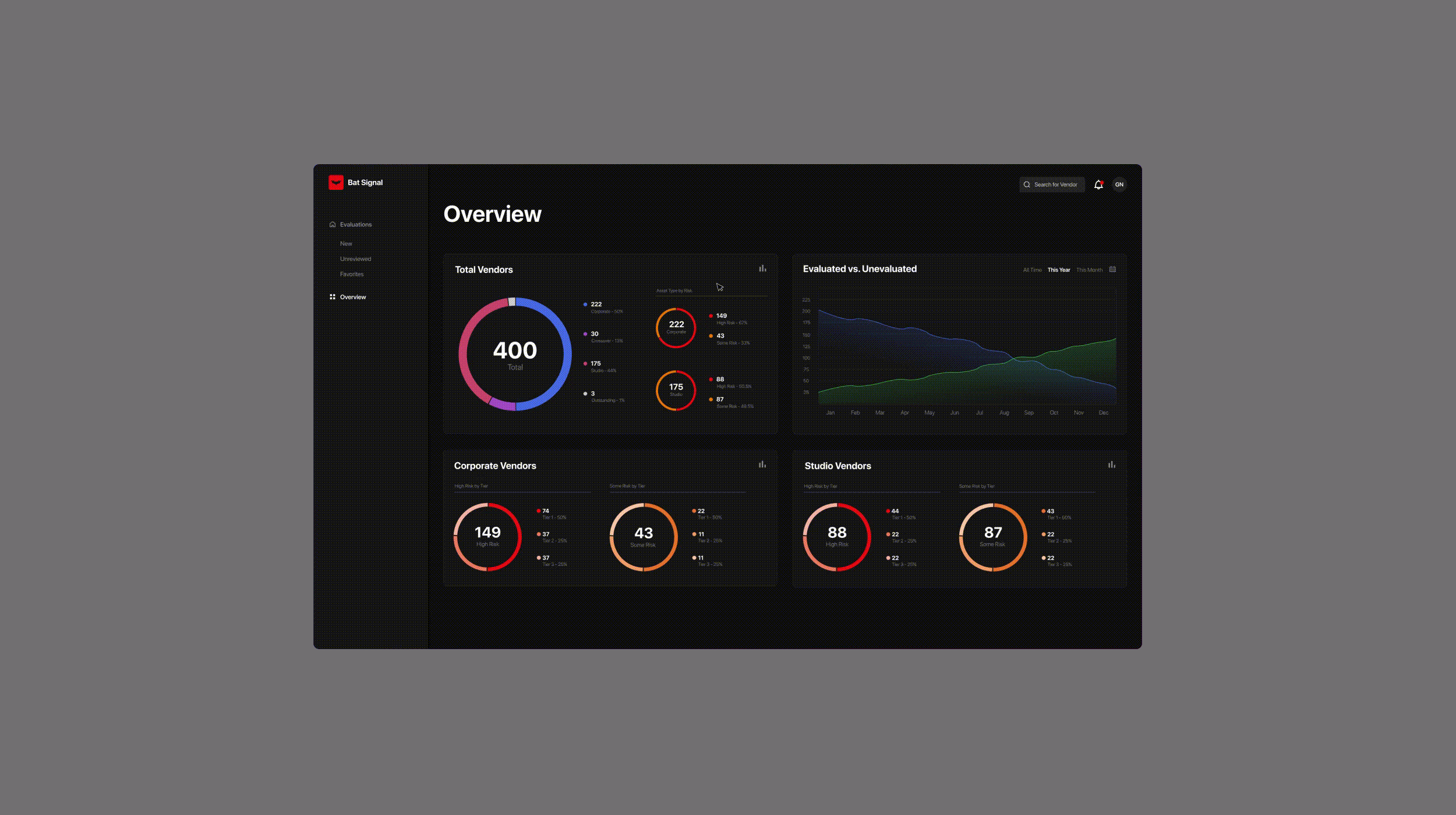
Netflix Bat Signal
An internal dashboard streamlines Netflix's security evaluation process for vendors and productions.
This interface serves as a way for users to understand the overall security risk of Netflix's vendors. We worked with the InfoSec team to understand the story the data needed to tell. The charts give a high-level status on how many vendors have been evaluated vs. unevaluated, with the ability to dive in deeper and understand which types of vendors had the most risk, which had not been evaluated, and which were blocked. This allows them to communicate to their higher-ups how the team is performing and how much risk Netflix is taking on at any given time. Users can customize their view to match their preferences by switching from doughnut charts to line charts. The Top Concerns card effectively categorizes vendors that need the most attention. This high-level view allows admins to effectively handle the highest risk situations and ensure that nothing is slipping through the cracks.

Design System and Guidelines

Design System and Brand Identity Guidelines
The Bicycle Collective was looking to refine its identity and expand its operation. They needed a robust and beautiful site to elevate their brand to be more contemporary, polished, and inclusive. They also hoped to increase revenue through their online store, serve as a central cycling resource, and raise awareness of their cause by offering more information and education.

Website Content Modules for Bicycle Collective
After getting aligned on overall style and wireframes, we identified what components we needed with special thought to the key pages and opportunities for custom design. Our team considered variations in screen size, content, and style when designing the site components. We also added new components we felt would be helpful for future updates.
User Personas
This was the output of a user persona exercise as part of a five-day sprint we undertook with the product team from Restoration Hardware.

Facebook Tuned
Tuned is new to the dating app scene. It offers a unique way for couples to feel connected to each other in a personal digital space. Couples on Tuned can use various features designed to help them express their creativity and share their warm, fuzzy feelings with their partners. Tuned is an app designed for NPE, an experimental group within Facebook

Facebook Movies
Making it easy for people to discover movies near them, purchase tickets, and plan an outing.

2021 Client Gift
Every year at Underbelly we created a gift package to send to our clients and friends. It was our way of showing our appreciation to the amazing people we collaborated with throughout the year. For this particular year, we wanted to have a bit of fun. After exploring many different concepts and styles, we landed on a direction that was just the right balance of weird, cool, and delicious — Underbelly Sammies.

2020 Client Gift

Spring Drop-In Identity
Underbelly’s Drop-In series is an opportunity for the team to get together with like-minded people, chat with industry folks and meet new friends. This year’s virtual event featured speaker panels and themed hangouts with the Underbelly team.

Underbelly